LCDM – Branding
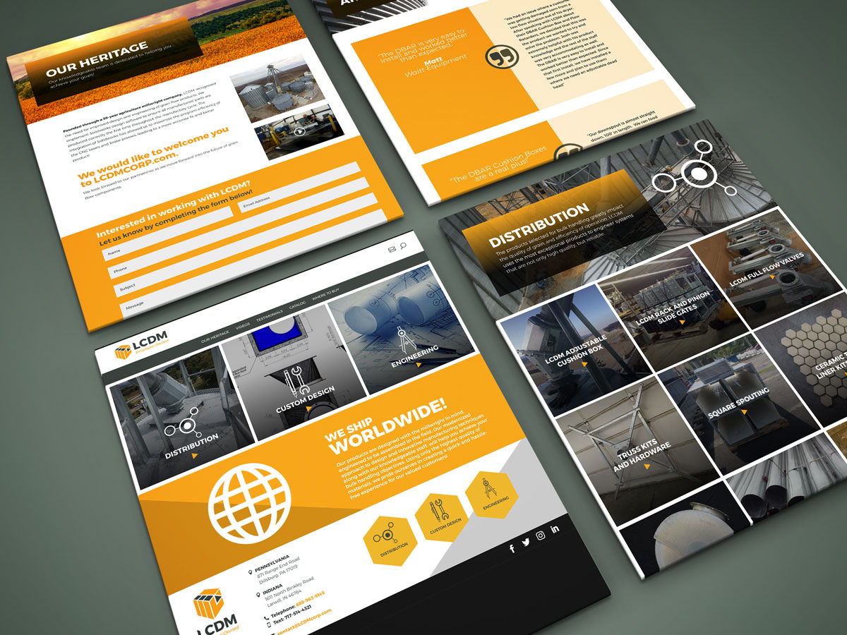
From its roots as an agricultural millwright company dating back four decades right up until today, LCDM has held fast to our principle of providing the best, highest quality possible grain flow products through better design and engineering.
“LC” in its name stands for L cubed and it was important to the client to incorporate that somehow into the logo. The resulting logo illustrators three 3-D L shapes. The logo completes the entire package by illustrating the efficiency of getting orders in and out for their customers.
Client:
Lindstrom Machining
Agency:
Suasion

