Nu World Foods Logo & BRANDING
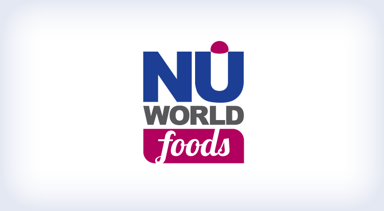
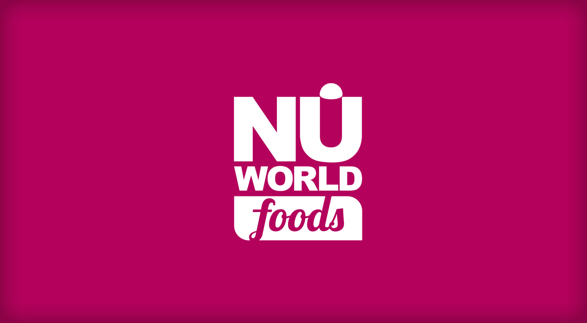
Much care went into understanding the landscape to which this new logo would need to both fit into and from which it should rise above. The NuWorld Foods visual brand consists of three elements working in coordination to form the basis of the logotype. These elements include the “NU” typography and silo icon, “WORLD” typography, and “Foods” script reversed out of the organic shape with two rounded corners. This company specializes in Ancient Grains. This logo was designed in Adobe Illustrator.
THE IDENTITY PACKAGE:
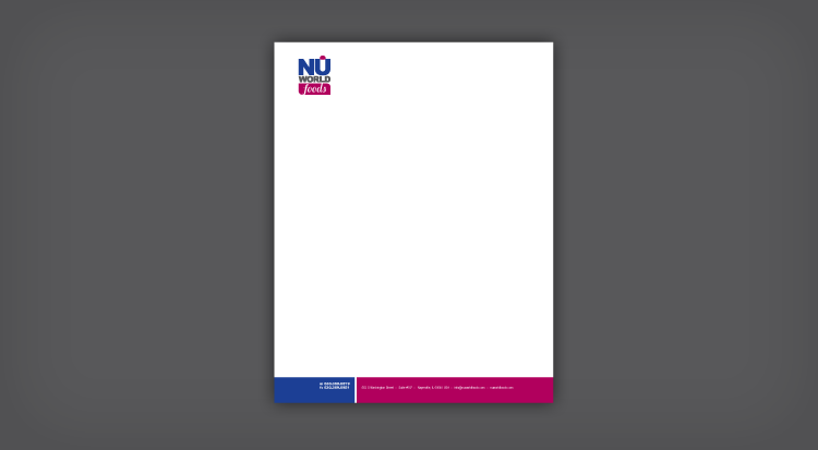
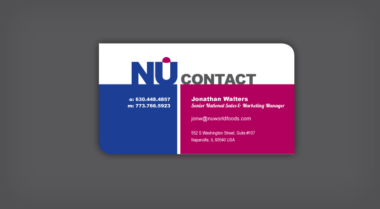
Along with a bold and modern logo, this company needed an identity package to begin shouting their sophisticated new brand above the noise of their competitors. This colorful yet clean palette will certainly certainly get noticed. A custom corner die-cut was incorporated to help their card stand out. This was designed in Adobe InDesign.
Client:
Nu World Foods
Agency:
Erik Piisila
My Roles:
Designer

