Parents’ Place of Maryland Logo & BRANDING
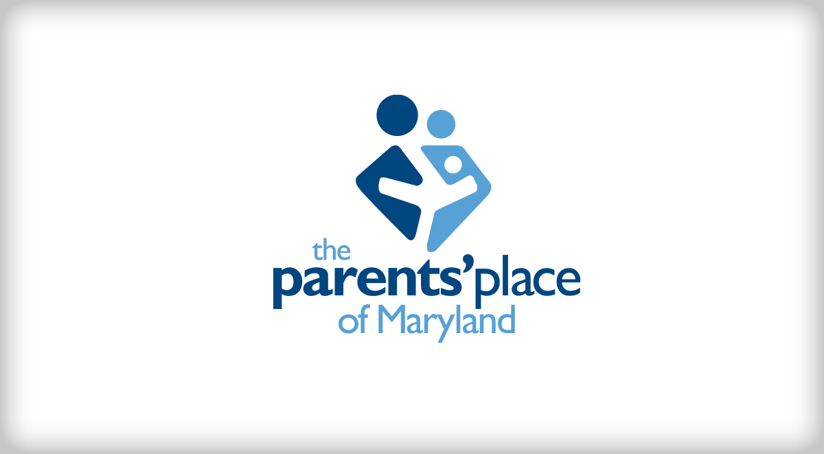
In a sea of crayon-styled typefaces and arms-outstretched dancing children, PPMD needed a logo that would position themselves as a confident leader in their field. This logo utilizes positive/negative space in its icon to illustrate a nurturing and supportive environment.
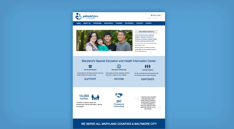
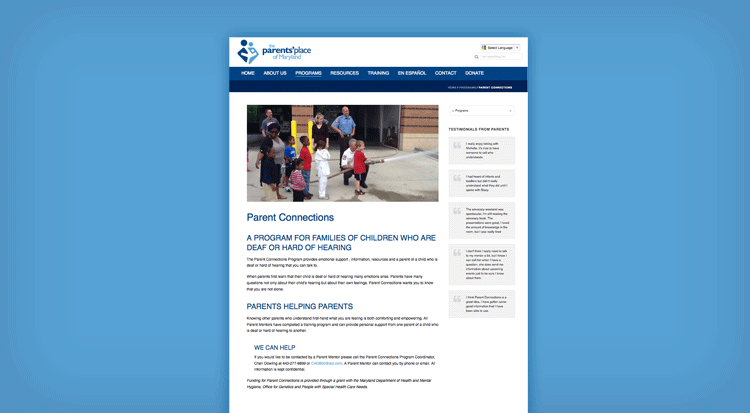
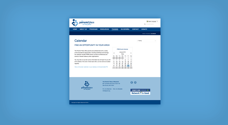
Accessible for its clients and updateable by its staff were the top priorities for this websites upgrade. This website design needed to utilize the WordPress CMS platform and perform optimally in a responsive mobile-ready environment. The design and content also prioritize 508 compliance. The site has since been re-designed.
Client:
Parents’ Place of Maryland
Agency:
Erik Piisila
My Roles:
Designer
Developer

